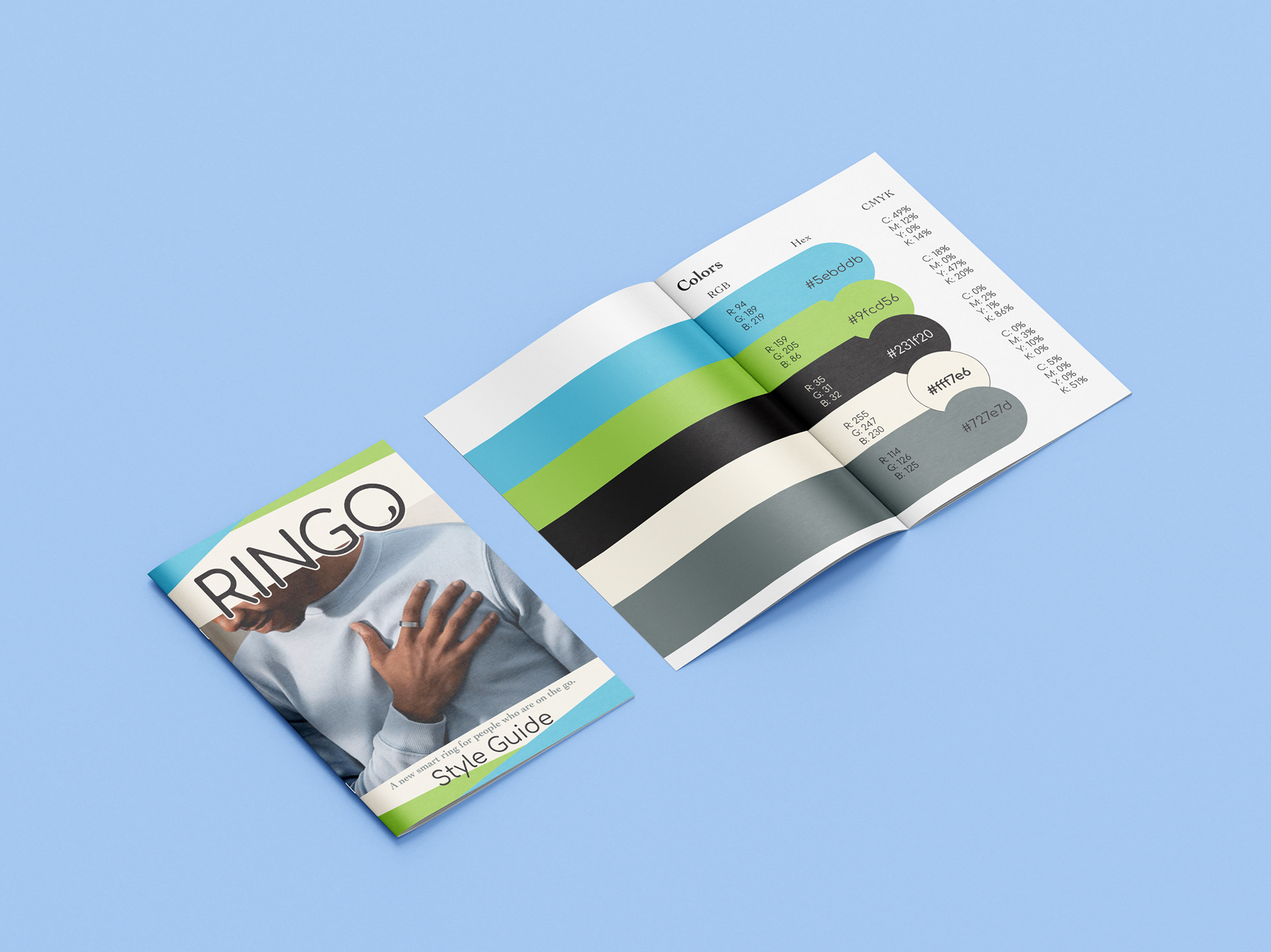
RINGO Style Guide Mockup
Design Brief and Initial Planning:
RING: a wearable tech ring that slips into your everyday life as easily as it slips onto your hand.
Functions and draws:
Apple and Android compatibility
Lower price than competitors
Unlock door and car
Sizes like a regular ring
NFC (wireless data transfer)
Comfortable, easy to wear, does not draw attention (give options for skins)
Can store vaccine info for ease of access
Can use to store credit/debit cards (scan ring)
Sleep analysis
Guided meditation
Health info (heart rate, temperature, respiratory rate) – can help catch covid19 symptoms early
Tracks physical activity (step counter, intensity of body movement “3D accelerometer and gyroscope track the intensity of body movement for active and inactive intervals”)
Set goals for physical activity, meditation, and sleep on the app
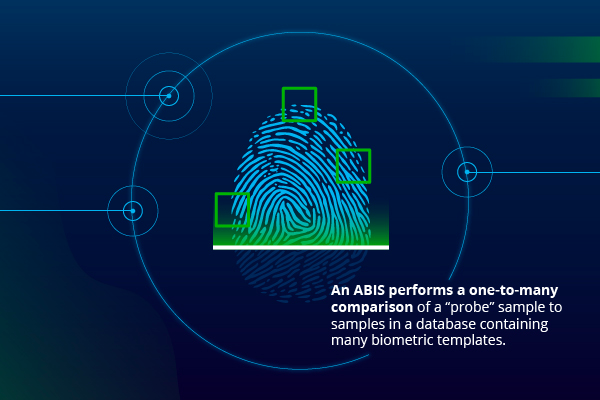
Recognises your finger and only works for you, more people can be added if wanted using finger geometry recognition
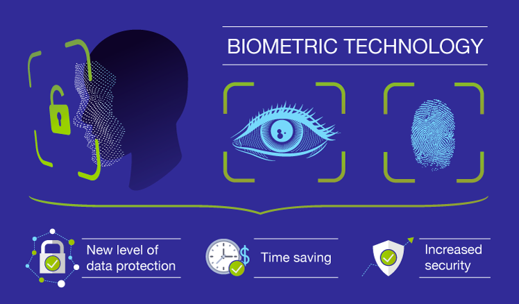
Biometric
Color palette:
Black
Green
White
Blue
Pink or Orange for accent color

Keywords for target aesthetic:
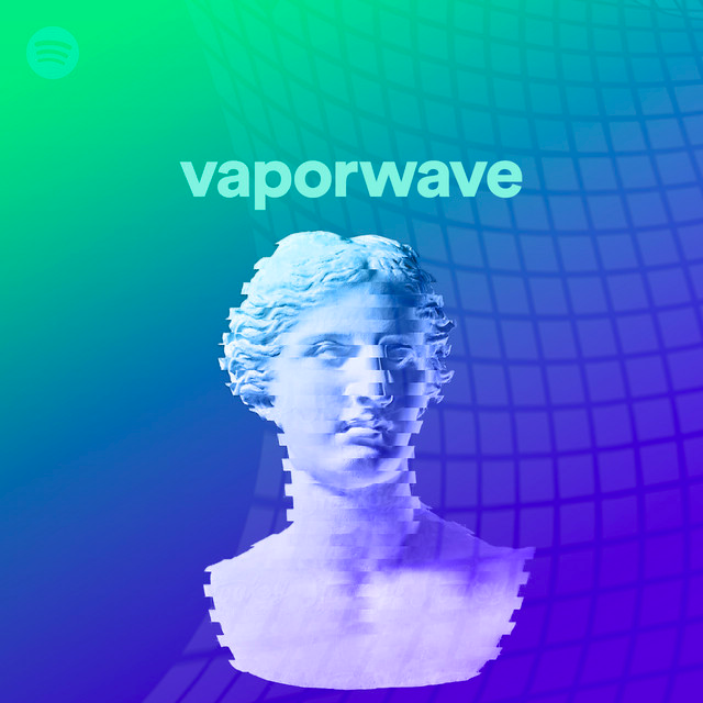
Combining images like the one below with more aesthetics popular with young people such as vaporwave or glitchcore/glowwave. Mix electronic with outdoors.
Biometrics
Vaporwave
Error/Glitch/Code
Hacker/Spy


Target Audience:
Athletic people
Tech savvy individuals
Young adults (genz and millenials)
Health conscious individuals
College students and people entering proper adulthood
People who want/have smart watches/fitbits
Logo first draft ideas:
Some useful links:
Looking into the current market and analyzing competitors:


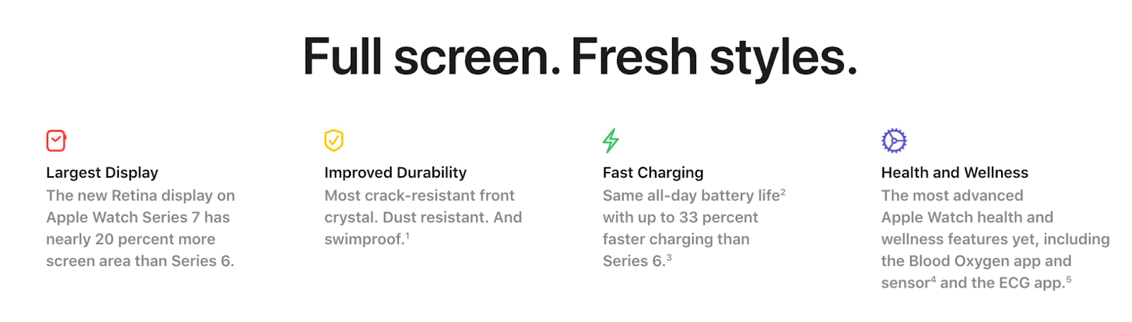
The main competitors that I’m looking into are the fitbit, the Apple Watch, and the OURA ring. The Apple website obviously is focused on multiple products so the brief for their smart watches is short. Customizability is largely advertised as a main draw for the current Apple watches. As well as the qualities seen in the picture below. They also seem to be a more expensive option with the cheapest starting at $399 and the most expensive being $1759.
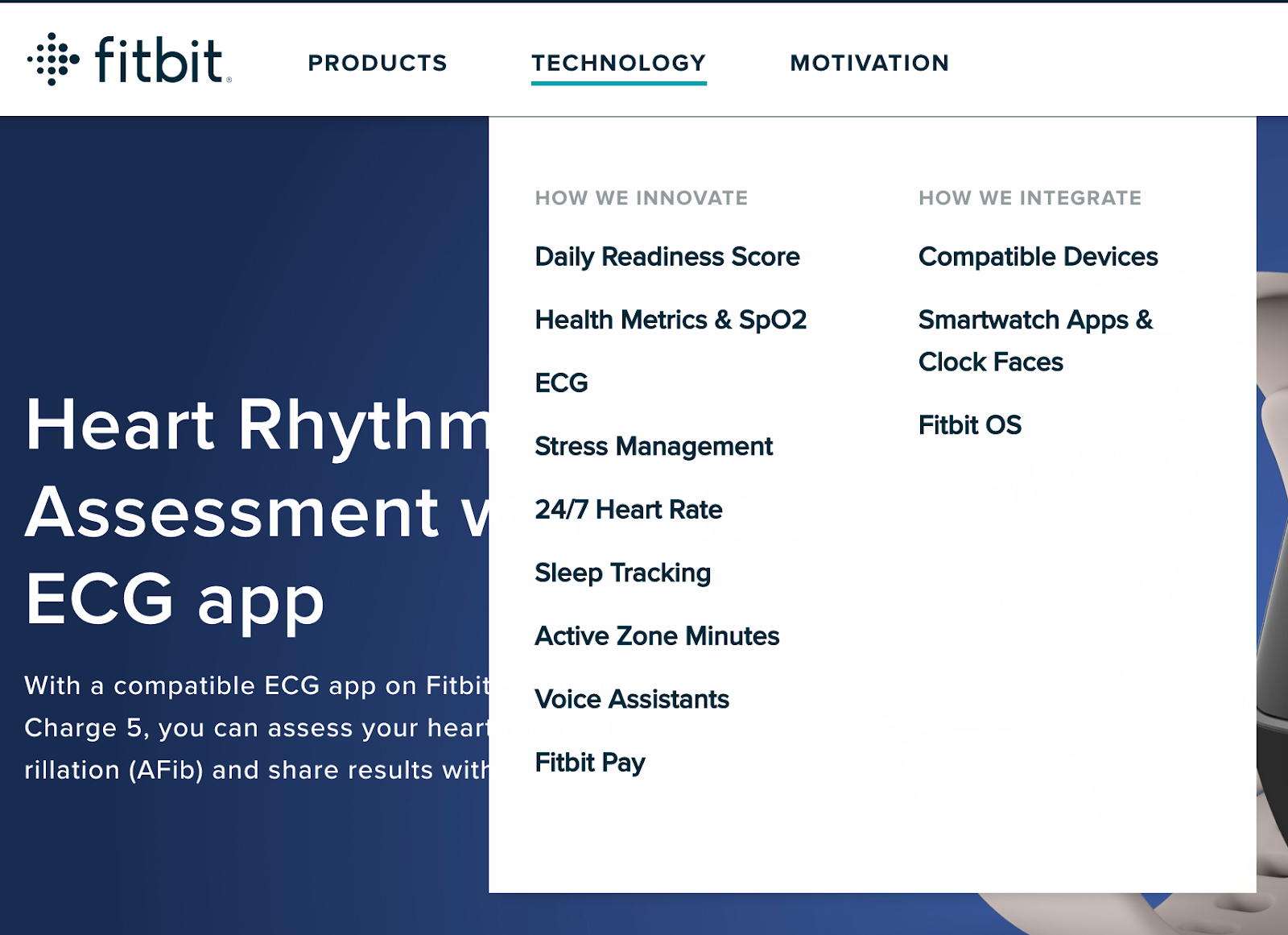
Fitbit’s website feels very cluttered in my opinion. It feels like there is no cohesive color scheme and there are too many detailed pictures that are visually overwhelming. The most expensive smart tech that they offer is right under $200, which is much more reasonable than the Apple prices. Instead of immediately giving you information about the product and what it does on their site, it just lists the products and links sponsors, commercials, and user experiences. All of the technological features are described in detail under each individual section listed here. I feel like these would only be helpful to an experienced user and they should maybe add an overview of the features that links to the individual information.
OURA is the biggest competitor that would arise.
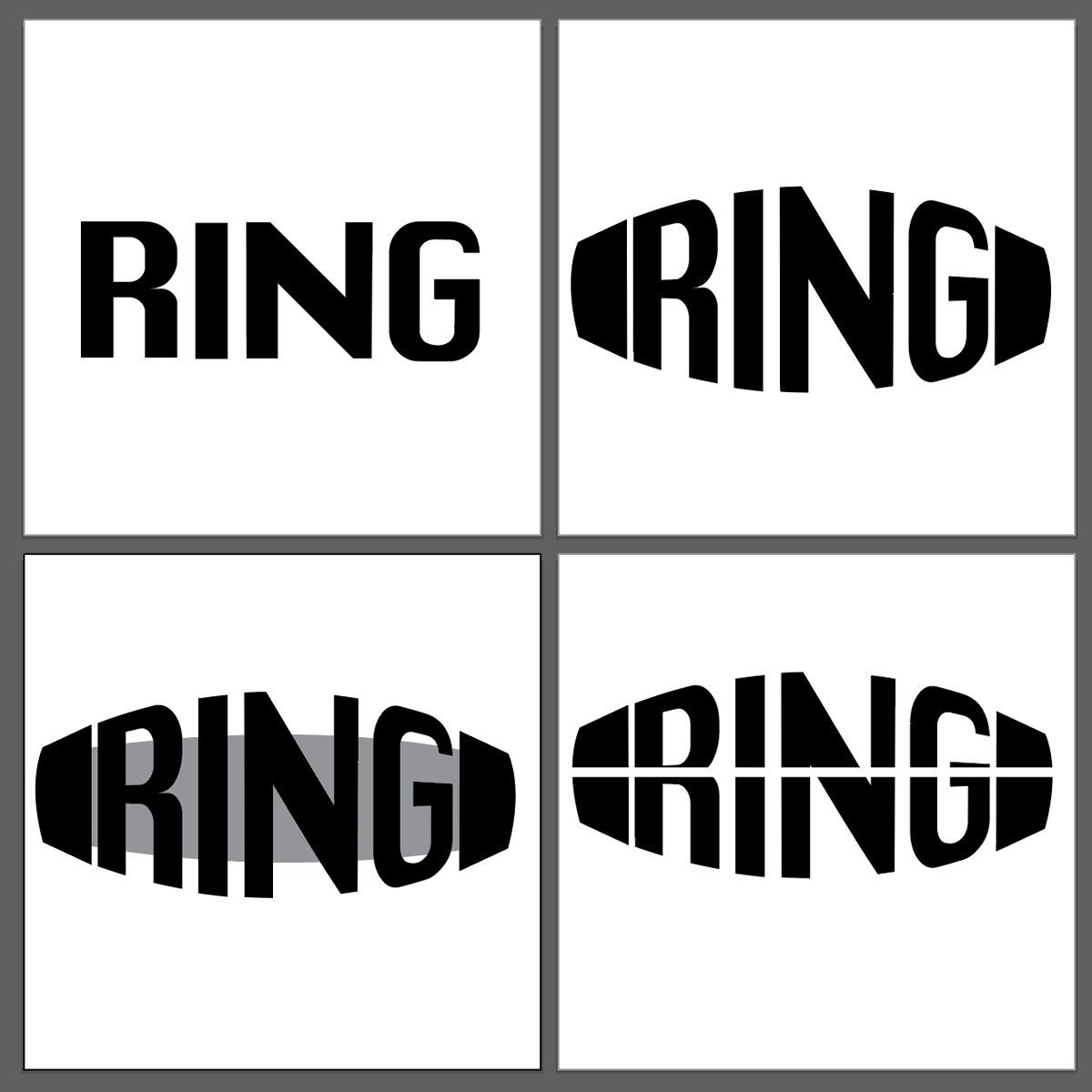
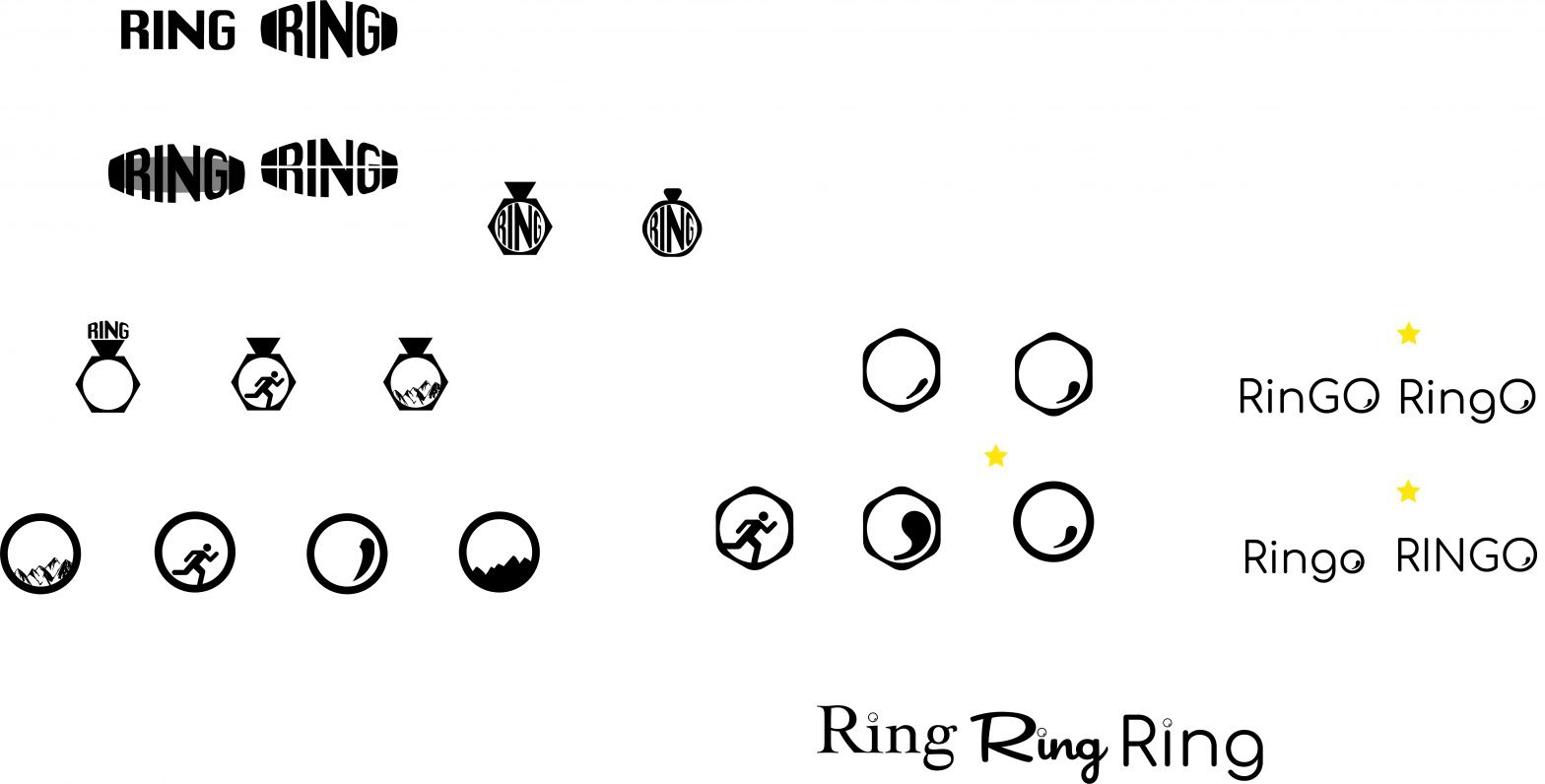
Logo variations and Name Change:
I ended up renaming my company from just “Ring” to “RingO” I feel like this gives the company more flexibility and avoids it getting confused with the Ring doorbell company. For the simplified logo, I like having the circle with the movement symbol inside (it is just a comma but still). This would also give an opportunity to create a motion graphic of the O rolling out the whole word or back into the more simple logo.
Having the word GO at the end could also imply movement and the ring tracking health, movements, steps, etc. could have implications with that “go”. The O being capitalized is just a stylistic choice as I think it looks the most cohesive within the logos that I have created.
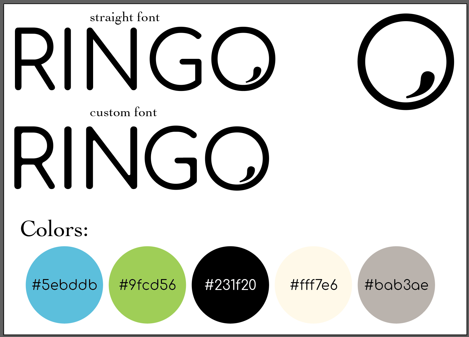
Here is the edits that I’ve made to the font to make it look more friendly and humanized. I’ve curved the edges of many letters as well as added some variation in line weight. I have also chosen a base color scheme for the brand including a warm while and grey, a black, and green and blue to represent both outdoorsyness and biometrics. The logo in the top right would be the recognizable logo and is also present in the full product name to help with individuality.